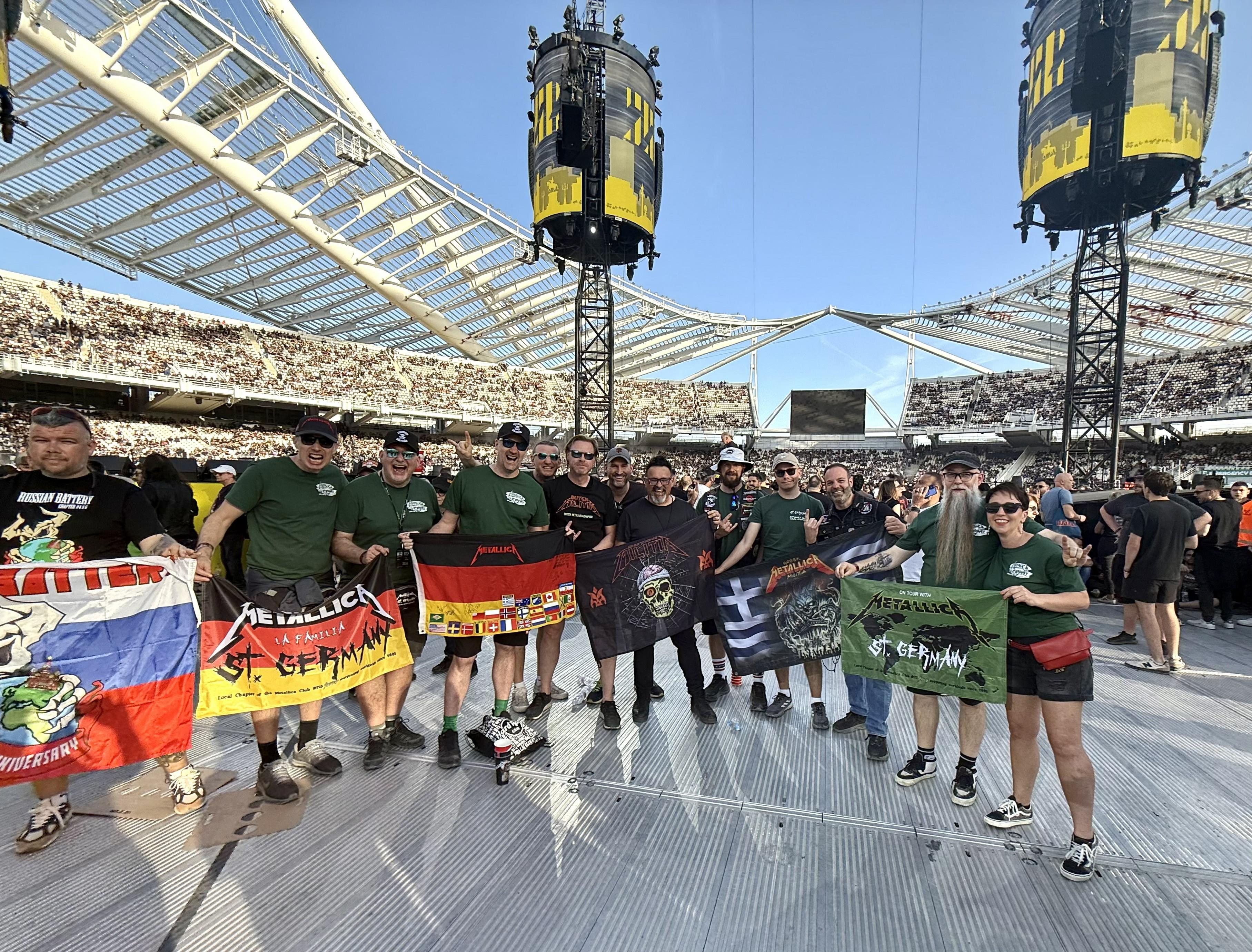
It is fair to say that the yellow and black color scheme for 72 Seasons threw a few people at first blush. There were associations with acts from yore, and there was simply the fact it was yellow and black, though old-schoolers will remember those colors on the inner sleeve of Ride the Lightning. Whatever the exact reason, it was a jarring and snap-to-it color scheme. But there was a commitment to carrying it through all aspects of Metallica’s 2023/24 activities, from product development to marketing to the stage. Whether you were initially thrown or not, the results have been an undeniably impactful success. The yellow, the black, and the unmistakable “M” have imprinted on millions of sub-consciences. And as 2023 draws to a close, from the tiniest avatar to the grandest mural, the 72 Seasons/M72 World Tour colors scream “Metallica” wherever you see them.

The goal for this era was a unifying look across mediums. It is why, in many ways, the whole 72 Seasons/M72 aesthetic carries the type of presence more associated with products and properties than bands. But with David Turner and Jamie McCathie (the latter now of creative company General) at the helm of design since Death Magnetic, Metallica has consistently been pushing towards a holistic visual moment like this.

What makes the visuals for 72 Seasons and the M72 World Tour work so well is that Turner and McCathie are not men of compromise. They argue the toss on anything they need to, and they ultimately get their way because Metallica holds trust in both their work and intensity.

Here, Turner and McCathie break down the creative process involved in creating not just the album artwork and packaging but the entire aesthetic of the 72 Seasons era.

WHAT’S IN A NAME?

David Turner: I had a cup of coffee with Marc Reiter [HQ big wig] in early 2022. By that point, he knew roughly when the album was coming out and, therefore, when the art had to be done, and he’s like, “Let’s get the ball rolling early!” Obviously, both Jamie and I have worked on some previous Metallica projects, but Marc said this time, they wanted it to be much more coordinated in terms of everything connecting in a big-picture sense.

All of that was interesting, but I was concerned. The way that we’ve always worked is to really have the identity be as coherent as possible. We don’t just say, “Let’s do some cool art even if we don’t know what the name of the album is or what it’s about!” So we lost a lot of time waiting to start the process until there was a name.

I remember at one point, Jamie and I were working together on suggestions for names. When we started that process, Lars said to me, “Look, everybody really trusts you. We know that the name is always a challenge, but you’ve nailed it before.”

My first attempt was picking through all the lyrics and finding a bunch of themes, some of which have been talked about a lot in the press, the whole thing of James’ formative years. But also, unusually, there was the redemption aspect, that hope that’s in this record, which is a big deal, and I think that is why James so favored the name “Lux Æterna.”

The process stalled because there was some disagreement. 72 Seasons is a very conceptual name, and it isn’t hard-hitting like Hardwired…To Self-Destruct or Death Magnetic or, you know, Ride the Lightning or Kill ’Em All. There’s an aggressive energy to every name that they’ve ever had, and 72 Seasons didn’t have that. In fact, we even joked that it could be like an old folk music album in the wrong context. But that was why Lars liked it so much; it was so out of left field, so, “What the fuck?” And that’s precisely what we should do. But I think James was really excited about “Lux Æterna” because it resonated with him emotionally. That, and he’s a closet graphic designer.


David Turner

YELLOW MAN

DT: We knew that the visual had to stop you in your tracks. Metallica is adamant about avoiding clichés, so it’s not like we could make it look like the metal-est metal cover ever. That’s the last thing they want.

I was struck by how powerful and relentless the music was. We use that word a lot: “relentless.” And so, with a title that didn’t communicate that, we knew there was a lot of pressure on the graphics to, at the very least, be show-stopping in some way.

The first visual idea that came to me was when I heard the song “Lux Æterna,” and there was talk of it being the single. What does eternal light look like? I thought, “Well, it’s the brightest color you can possibly have, almost too bright to look at.” That doesn’t want to be white because white is kind of bland. But yellow… I just thought the eternal light is yellow. So, the yellow came directly from one song and its spirit of hope and optimism. But it’s not a happy, jolly, sing-along album. There’s also so much of the usual Metallica darkness, so I knew it had to be combined with something to convey that.

Credit to Jamie; he pushed for this to feel contemporary throughout the entire process. He had a real sense of that, which brought us Tim Saccenti, the video director, and Lee Jeffries, the photographer. Jamie also pushed for the way we used color. And I completely trusted him, partly because he’s a lot younger than me, but mainly because, as a huge fan, he has a real feel for this genre.

Jamie McCathie: The name was intriguing because it was so “non-metal.” I felt the excitement of this name, which doesn’t sound like your average Metallica album. That was the thing I held onto throughout; it needs to not look and not feel like your average Metallica album.

My memory of the yellow was a piece of type on the brightest yellow background that said “Lux Æterna.” It was a sketch David brought, and I thought it was so cool because it was just such an unexpected color for them. No one was going to look at that and go, “Oh, that looks like Metallica,” because it simply doesn’t. So it just felt right… and wrong… which made it feel even more right. It was perfect.

ALL PLACEMENTS GREAT & SMALL

DT: At Turner Duckworth, the design company where we both worked for a very long time, part of our job was taking big, sprawling brands and making them operate across many different touchpoints, from billboards to app icons to digital marketing. All over the place. And somehow making sure that people noticed and recognized the brand wherever it was.

Lars has gotten increasingly into the power of design over the years. The reason Marc approached me so early — and what Lars was pushing for — was this feeling that we can be more cohesive in everything we do than we’ve been in the past. Color is always a great way to achieve that, especially if it can be an unusual, unexpected color. I would say that the application I personally thought about the most was actually the opposite of the large scale you were talking about. The massive billboard is one thing, but I thought of somebody scrolling through new music on their phone, like “What’s come out this week,” and wanting to stop them in their tracks. “What the hell is that?”

The simple yellow-black combination sets itself apart. So, when “Lux Æterna” debuted, and amongst a bunch of other songs in your Spotify stream or whatever, you saw a super simple graphic – a black M with the guy on a yellow background – it stuck out like a sore thumb. That was very deliberate.

These colors have a conceptual basis. There’s a reason we’re doing this, which is about the art, but there’s also a practical thing. We want people to know Metallica’s got a new album out, and if we can wave the flag in their face, they’ll notice. And when they notice, they’re more likely to listen. Ian Conklin, another former Turner Duckworth artist who worked with Metallica before, was also part of this. Jamie suggested bringing him in, and he was the perfect fit to work on the typography for the whole release, that very chiseled, classic font that isn’t trying to look metal.


Jamie McCathie

JMC: There was an email or conversation that David had with James, and we used that a lot, almost as our brief. It was this amazing, succinct, descriptive paragraph that gave us so much to work with.

DT: I had asked James to write a bit about what 72 Seasons meant to him. But even before we received that, Lars shared that James did say one thing he thought was particularly interesting, which was “prisoner of childhood.” So Lars was the guy who distilled a lot of what James had to say into a phrase that became extremely powerful for us creatively. It was a brilliant synthesis of all the ideas behind 72 Seasons in three words.

HOW WE ARRIVED AT BURNT TEDDIES

JMC: I remember listening to the album at HQ. This idea of darkness and lightness and the contrast and shadows was just constant, so I went down that rabbit hole while David was in the “prisoners of childhood” frame. We presented many different ideas to the band, and ultimately, there were aspects of several different things that they really liked. So, we got to a second or a third round quite quickly.

DT: If you look at the final cover, the idea of light and shadow is right there in how this thing is photographed. It’s super bright in the center, and the shadows emanating from the crib itself are falling across the whole composition. Feeling that light was something James was intent on.

When we first presented the crib, it was very raw: just a crib on a white background, but there’s a sense of tragedy. It’s burned, but in such a way that it looks like the bars have broken. And with the glow behind it, has somebody escaped from this prison? Or were they trapped in it and doomed? Maybe the little baby escaped? With album cover art, you want it to be open to interpretation. So, we included these elements with intention but left it open-ended enough that fans and members of the band could see it slightly differently.

As we presented the different concepts, the guys would take turns sharing their opinions. I want to say that Kirk was the last to go. He said, “You’ve got some cool ideas here, but when I saw that burned crib, I was so deeply, emotionally uncomfortable. I felt a physical effect that this baby might’ve been burnt. What the fuck happened there? I think that’s the one we’ve got to do because we need to be doing something that powerful. Something unafraid of subject matter.” The other band members were already interested – no one had come out and said they hated the crib. But he gave this very eloquent speech to support it, and his thoughts made everybody else go, “Whoa, yeah…”

The process of creating the final art was quite fun. I mean, with album covers – even for Metallica – you must be somewhat sensible about how you spend your money. So, at least half of what you see was bought from thrift stores by my wife, Ellen. We wanted a mixture of items representing somebody throughout the ages, from zero to 18 years, and we selected very symbolic pieces. I think it was James who was pushing for some challenging things. We’ve got a switchblade in there. We’ve got cigarettes and pill packets; we didn’t want to avoid the Oxy epidemic and all the terrible things that are happening to kids. So there’s lots of meaning behind all these little elements. Yet they’re still open to interpretation; there’s no liner notes explaining anything. It’s up to you to discover, and we expect that a lot of people will never know what “that thing” is unless they read this article.

JMC: We were also careful not to be overtly “old” or “new.” There was a conversation about not including a cell phone, so you almost didn’t know when this was. We were purposefully ambiguous so it would remain relatable to any era or age group.

DT: There’s a good friend of mine who I’ve frequently worked with – a photographer called Stan Musilek – who primarily shoots glamour and cosmetics. He has a studio in San Francisco, and he’s an old-school guy who is also on the cutting edge of technology, an absolute master. So, if you describe what you’re looking for, he’ll get it exactly right.

What we were really after here was for all these objects to look like they were rescued from a tragic house fire where everything was destroyed, yet we didn’t want to just show a burnt-out home; that’s too one-dimensional. We wanted to take the items out of context and place them in a setting that almost felt like an art gallery or a weird online virtual space. Into some environment where they’re entirely foreign because then they start to feel more symbolic.

Stan has a massive booth in his studio that’s big enough to photograph cars and things; it has a curving back so that you don’t see any horizon. He painted the whole thing bright yellow, and he hired a model maker, Mark Welsh. The term “model maker” in photography and film implies they’re always making something, but in this case, he was destroying things.

The brief to him was to take that guitar and fuck it up in a way that looks like it really burnt in a fire. It’s got lots of texture and character, but it’s still very clearly recognizable as a guitar. Take it as far as possible before it becomes unidentifiable. And with the crib, the specific bits that we weren’t going to use were cut away, and the exposed ends were burnt carefully to make it look like, yes, there was a raging fire in the center that burned that out. It was all done very delicately using a blowtorch, a very artistic process. It almost looks like a CGI image, yet it’s as real as you could get!


…SO NEARLY MASKS!

DT: We pursued a couple of blind alleys! We had a great concept that involved masks that fit the theme of “Who are you? Are you the real you? Or are you trying to be something you feel you should be?” We had a cool, modern execution, but we eventually decided that masks and metal were overdone.

WORKING WITH METALLICA

DT: It’s just such a pleasure working with them. They really respect design. I mean, James has this visceral love of it. And Lars always pushes us into the art world a little more, like, “Let’s be a little edgy about it.” But all four of them, particularly this time, totally engaged in the process and were super supportive while still telling it like it was. If they didn’t like something, they were very direct.

They leave these vast, wide, open expanses to be creative in. Most clients really want to narrow it down to work in this little tunnel, but not Metallica. They’re like, “We want it to go wider. We want you to think broader, bigger…” So, for me, it’s always fun working with them.